How to Add SVG Icons with Drupal SDC
Adding social icons to your Drupal site is now easier and more flexible—especially if you’re using a custom theme with UI Suite and DaisyUI. In this blog, I’ll guide you step-by-step on how to create and use your own icon component with the SDC (Single Directory Component) system in Drupal. We’ll render icons via Drupal’s Icon API using the icon() Twig function, giving you full control over icon styles, sizes, and links.
Let’s begin!
Step 1: Required Modules and Base Theme
Before you start, make sure you have the following modules installed and enabled. These are required to work with UI Icons and SDC components.
Required Modules
- UI Icons
- UI Suite
Installing UI Suite UI will also automatically provide the following related modules:
○ UI Icons for Menu
○ UI Icons Form Element
○ UI Icons Iconify API (Deprecated but sometimes needed)
○ UI Icons Library
○ UI Icons Media
○ UI Styles Block
○ UI Icons for UI Patterns
○ UI Icons Sol
Base Theme (Optional):
DaisyUI – It’s not necessary to use DaisyUI as your base theme, but if you do, you will automatically get a mytheme.icons.yml file. This file is used to declare and manage your icon packs. Without DaisyUI as the base theme, you’ll have to manually create this file. DaisyUI also gives you access to more built-in icons and pre-styled components.
These modules provide the structure and functionality you need to render SVG icons easily and dynamically.
Step 2: Create Icons Folder in Your Theme
Inside your custom theme folder (for example: themes/custom/mytheme/), create a folder called icons/custom
Add Your SVG Icons
- Place all your SVG files (e.g. icon_facebook.svg, icon_x.svg, icon_linkedin.svg) inside this icons/custom folder.
- Each SVG should follow these guidelines:
1. ViewBox → Always use viewBox="0 0 100 100" for consistency.
2. Stroke/Fill Color → Do not hardcode colors (like #000000 or #ffffff). Instead, use:
stroke="currentColor"
3. This ensures your icons automatically adapt to the theme’s text or CSS color.
This way, your icons will scale properly, inherit colors from your theme, and integrate smoothly with the UI Icons system.
Step 3: Create Icon Pack YAML File
Now, create a YAML file called mytheme.icons.yml inside your theme. If you don’t have the daisy ui as dependent theme. This file registers your custom icons with Drupal.
mytheme_icons:
label: "My Theme SVG Icons"
extractor: svg
config:
 sources:
 - icons/custom/*.svg
settings:
 size:
   title: "Size"
   type: integer
   default: 30
template: >-
 <svg xmlns="http://www.w3.org/2000/svg"
     class="icon text-icon-{{ icon_id|clean_class }} {{ attributes.class }}""
     width="{{ size|default(30) }}"
     height="{{ size|default(30) }}"
     viewBox="0 0 100 100"
     fill="none"
     stroke = "none"
     stroke-width= "2"
     aria-hidden="true">
  {{ content }}
 </svg>
What this YAML file does:
Icon pack mytheme_icons: is the icon pack ID which you will use in the icon(),
- label: human-readable name of your icon pack.
- extractor: tells Drupal to read and extract content from your SVG files.
- config.sources: tells Drupal where to find the icons (relative to theme folder).
- settings.size: lets you control icon size.
- template: how each icon should be rendered into HTML. it will send attributes to the svg element.
If you want to use more advanced features like custom colors, viewBox, etc., you can use this advanced version: you can also use the following method for the template.
<svg
{{ attributes
    .setAttribute('viewBox', attributes.viewBox|default('0 0 100 ,100'))
    .setAttribute('width', size|default('32'))
    .setAttribute('height', size|default('32'))
    .setAttribute('fill', color|default('currentColor'))
    .setAttribute('aria-hidden', 'true')
}}>
{{ content }}
</svg>
Step 4: Use icon() Function in Twig(optional)
We will follow this step if want to render the icon derectly without sdc. If you use sdc you can skip this step
To show the icon in Twig, use the icon() function like this:
{{ icon('mytheme_icons', 'icon_facebook', { size: 40 }) }}
- First value is the icon pack ID (mytheme_icons)
- Second is the icon file name which should be same as icon name (without .svg)
- Third is an optional object for customization
Step 5: Create an Icon Component (SDC)
Let’s create a reusable icon component sdc_icon
You will need two files:
- cutom_icons.component.yml
- custom_icons.twig
custom_icons.component.yml
Name: custom_icon
description: icons components
props:
type: object
properties:
 iconTitle:
   type: string
   description: The title of the card.
 iconStyle:
   type: string
   description: "you don’t need to have any select filed select anyone from bellow according to view mode"
   enum:
     - solid
     - fill
     - outline
     - roundfill
     - roundoutline
   meta:
     enum:
       solid: "Solid"
       fill: "Fill"
       outline: "Outline"
       roundfill: "Round Fill"
       roundoutline: "Round Outline"
 iconFillColor:
   type: string
   description: iconfillColor selectList( create a list of colors )"
 iconStrokeColor:
   type: string
   description: iconstrockColor selectList(list of stroke colors)
 iconSize:
   type: string
   Enum: [miro, mini, default, lg, xl]
   description: select list for iconSize with values(miro, mini, default, lg, xl) values should be same as given
 Linktext:
   type: string
   description: "(if you want text put the text in link if you only want icon keep the link text empty)”
 iconLink:
   type: string
   description: "link of the icon"
While creating the structure you need to create a select list for the icons which you are going to use so please keep the values same as the name of the icon without .svg . For example, if the SVG file is icon_facebook.svg, then the value of iconTitle should be icon_facebook.
Custom_icons.twig file.
If you are still confuse, then before creating custom_icons.twig file you can read the following comments on this sdcs it will clear all your doubts.
{#
------------------------------------------------------------
Custom Icon Component: icon.twig
------------------------------------------------------------
:white_check_mark: Usage Guidelines for Developers:
1. :wrench: ICON FOLDER & NAMING (IMPORTANT):
  - All SVG icons must be placed inside:
    ➤ themes/custom/YOUR_THEME_NAME/icons/custom/
  - Icon filenames must follow the pattern:
    ➤ icon_NAME.svg
    ➤ Examples:
      • icon_facebook.svg
      • icon_x.svg
  - These icons are registered via `YOURTHEME.icons.yml`.
    ➤ Ensure your pack name (e.g., `tailpine_icons`) is declared properly.
2. :jigsaw: COMPONENT STRUCTURE (custom_icon.component.yml):
  This component accepts the following **props**:
    ┌───────────────────┬───────────────────────────────────────────────┐
    │ Prop Name        │ Description                                  │
    ├───────────────────┼───────────────────────────────────────────────┤
    │ iconTitle        │ Machine name of the icon (e.g., icon_facebook) │
    │ iconStyle        │ Visual style variant (options):               │
    │                  │  - solid                                     │
    │                  │  - fill                                      │
    │                  │  - outline                                   │
    │                  │  - roundfill                                 │
    │                  │  - roundoutline                              │
    │ iconFillColor    │ Fill color (uses Tailwind color tokens)       │
    │ iconStrokeColor  │ Stroke color (uses Tailwind color tokens)     │
    │ iconSize         │ Icon size (miro, mini, default, lg, xl)       │
    │ Linktext         │ Optional link text shown beside the icon      │
    │ iconLink         │ URL the icon should link to                   │
    └───────────────────┴───────────────────────────────────────────────┘
  :exclamation: Note:
     - `iconTitle` must match the filename (excluding `.svg`).
       Example:
         - iconTitle: icon_facebook → filename: icon_facebook.svg
     - All SVGs **must use**:
       ➤ `viewBox="0 0 100 100"`
       ➤ `stroke="currentColor"` / `fill="currentColor"`
       (No hardcoded colors!)
3. :art: ICON STYLE → CLASS MAP
  Tailwind utility classes applied based on `iconStyle`:
    - solid       → outline-none bg-none
    - fill        → rounded bg-[fillColor] hover:bg-[strokeColor]
    - outline     → rounded outline-2 outline-[strokeColor] hover:bg-[strokeColor]
                     hover:outline-none hover:text-[fillColor] hover:stroke-[fillColor]
    - roundfill   → rounded-full bg-[fillColor] hover:bg-[strokeColor]
    - roundoutline → rounded-full outline-2 outline-[strokeColor] hover:bg-[strokeColor]
                     hover:outline-none hover:text-[fillColor] hover:stroke-[fillColor]
:file_folder: This file dynamically renders SVGs using the `icon()` function,
  while applying Tailwind classes according to props.
#}
This file controls how your icon appears. It uses Tailwind classes to style your icons dynamically.
Custom_icons.twig file code is
{% set icon_name = iconTitle|striptags %}
{% set icon_style = iconStyle|striptags %}
{% set fill_color = iconFillColor|striptags %}
{% set stroke_color = iconStrokeColor|striptags %}
{% set icon_Size = iconSize|striptags %}
{% set selected_icon = icon_name %}
{% set sizeMap = {
'miro' : 16,
'mini' : 20,
'default' : 24,
'lg' : 32,
'xl' : 40
}%}
{% set style_classes = {
'solid': 'outline-none bg-none',
'fill' : 'rounded bg-' ~ fill_color ~ ' hover:bg-' ~ stroke_color ,
'outline':'rounded outline-2 outline-' ~ stroke_color ~ ' hover:bg-'~ stroke_color ~ ' hover:outline-none hover:text-' ~ fill_color ~ ' hover:stroke-' ~ fill_color ,
'roundfill': 'rounded-full bg-' ~ fill_color ~ ' hover:bg-' ~ stroke_color ,
'roundoutline': 'rounded-full outline-2 outline-' ~ stroke_color ~ ' hover:bg-'~ stroke_color ~ ' hover:outline-none hover:text-' ~ fill_color ~ ' hover:stroke-' ~ fill_color
} %}
{% set iconStyle_classes = style_classes[icon_style|default('solid')] %}
{% set sizeOfIcon = sizeMap[icon_Size|default('default')] %}
{% if Linktext %}
{% set linkClasses = 'flex justify-start items-center gap-5 mb-5' %}
{% else %}
{% set linkClasses = 'inline-block h-fit w-fit mr-5' %}
{% endif %}
<div class="{{ linkClasses }}">
<a href="{{ iconLink }}"
class="group inline-block w-fit {{iconStyle_classes}} text-{{stroke_color}} hover:text-{{fill_color}} " width="{{sizeOfIcon}}" height="{{sizeOfIcon}}">
{{ icon('tailpine_icons', selected_icon, {
size: sizeOfIcon
}) }}
</a>
{% if Linktext %}
<span>{{ Linktext }}</span>
{% endif %}
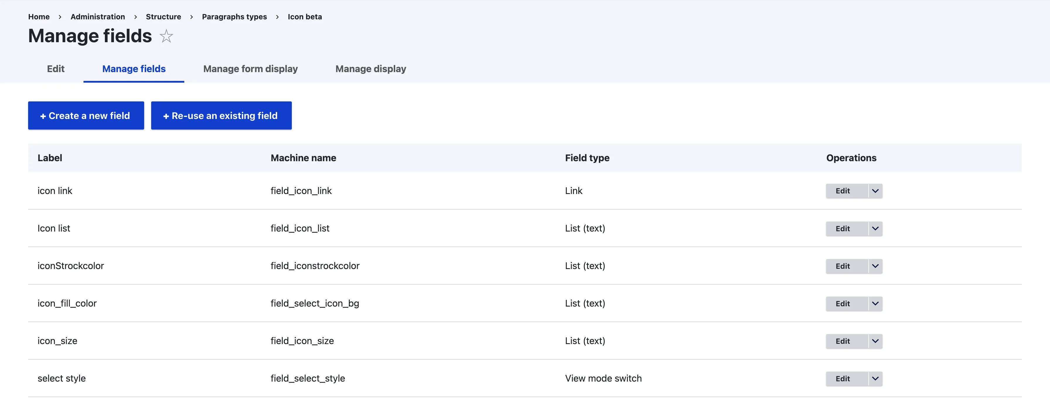
</div>Step 6: Create Paragraph Type and Map Fields
Now go to:
Structure → Paragraph Types → Add new (e.g. Icons)
Add these fields:
- Icon Title (Select list with values like icon_facebook)
- Icon Style (Select list with machine names matching style keys like default, solid, etc.)
- Icon Color (Select list with values like primary, secondary)
- Icon Link: Note (Add the URL for the social icon. It also have link text keep it empty if you only want icons, if you need icons with title then you can write the title)
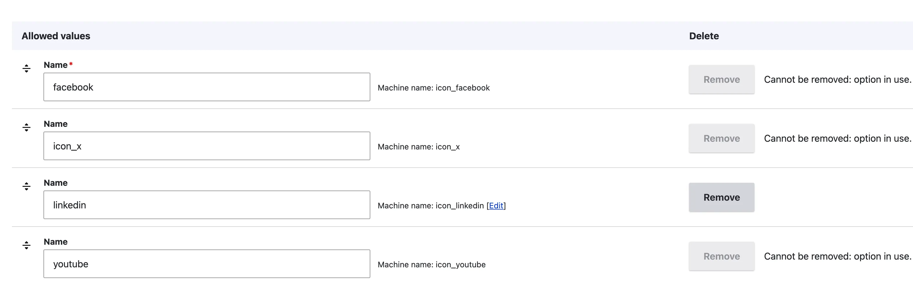
- Icon List (Select list with values same as icon name with out .svg)
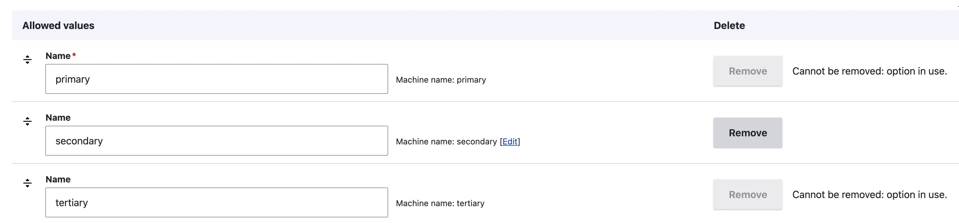
- Icon Stroke Color (List of stroke color in values name of any color you like for stroke)
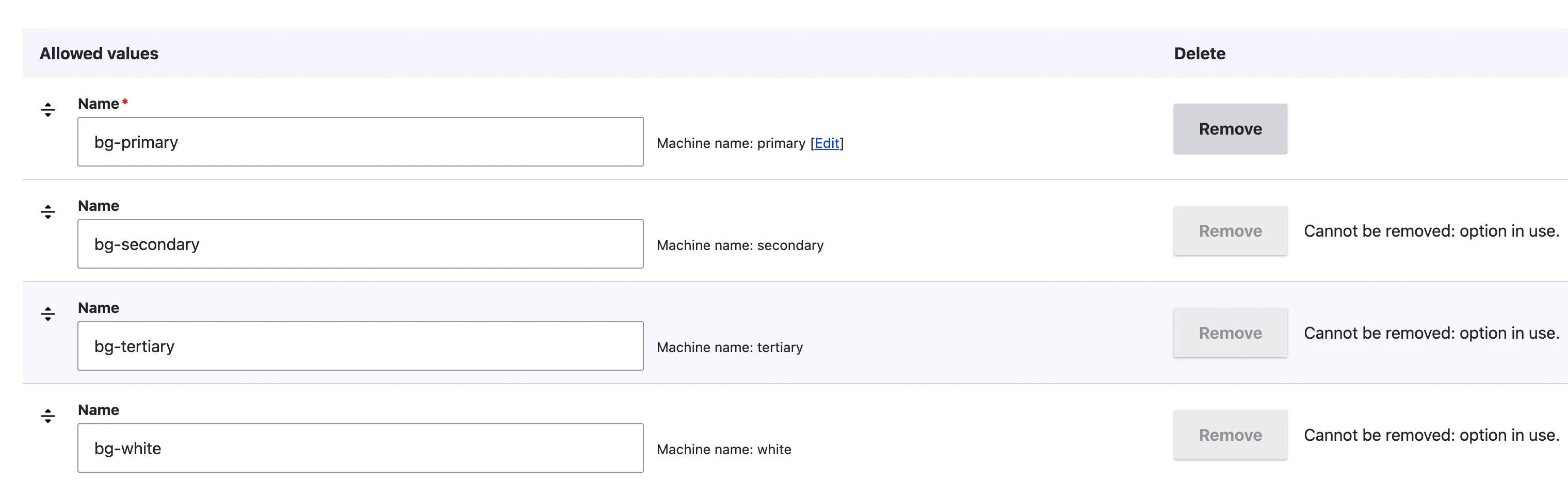
- Icon Fill Color (list of colors which you like for fill or icon
- Icon Size (size list values should be [miro, mini, default, lg, xl])
- Select Style (View mode switch) need viewmode switcher module as well
Fields visual representation in
Select List for icon list visual representation is :
Icon_fill_color select list visual representation of allowed values:
Icon_strock_color select list visual representaion:
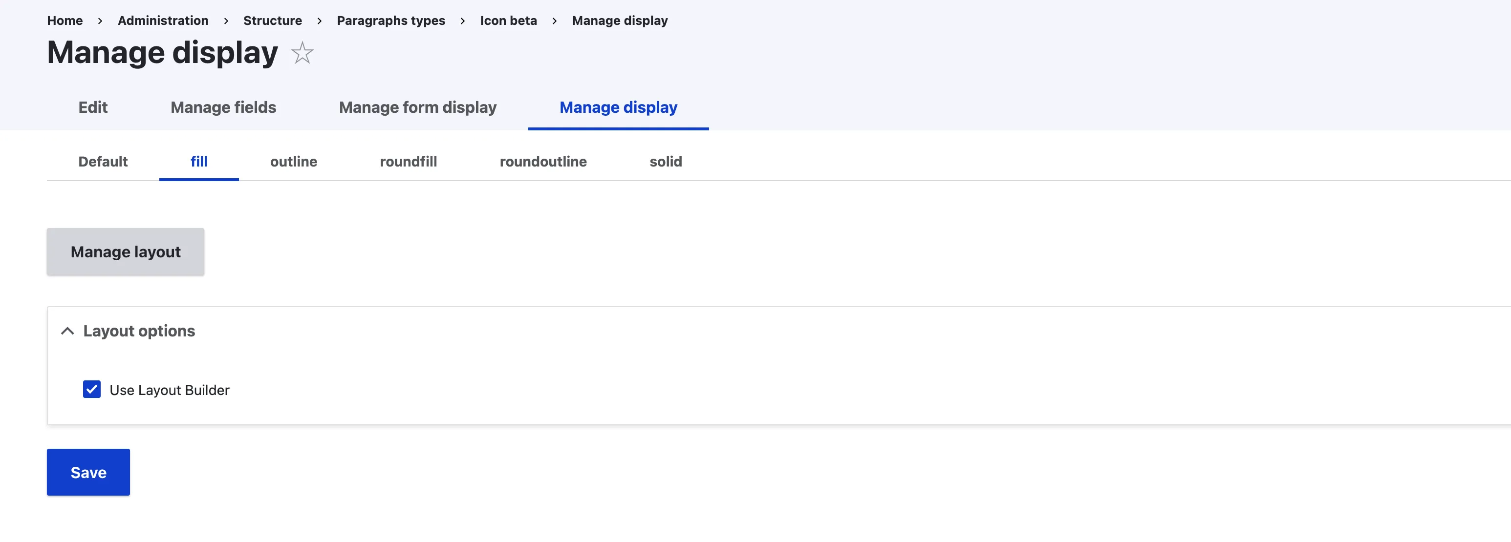
Step 7: Create View Modes for Icon Styles
Now that we have our basic fields ready, the next step is to define view modes for different icon styles. In our case, we’ll be using the following styles:
- Fill
- Outline
- Solid
- Round Fill
- Round Outline
Each of these will be treated as a separate view mode so that we can control how the icons look in different scenarios.
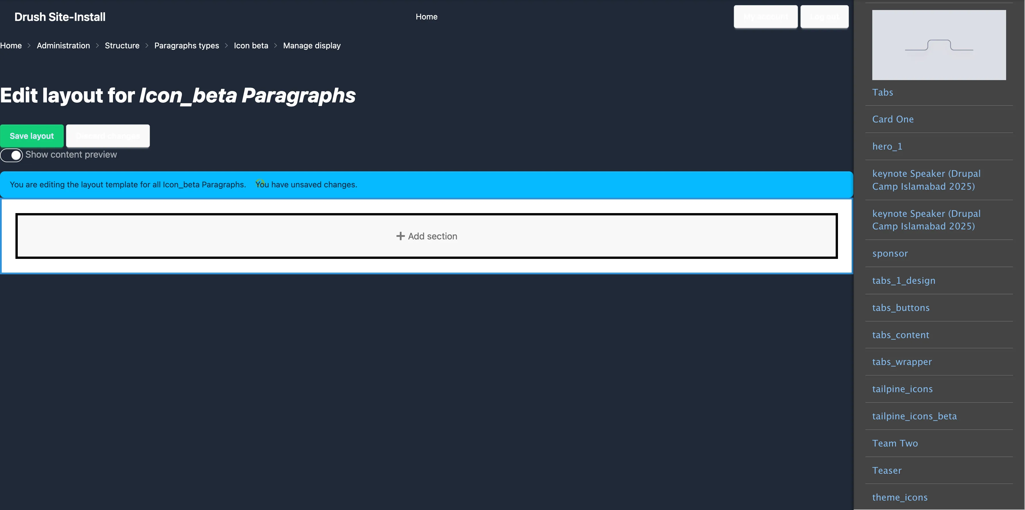
Enabling Manage layout from the manage dispaly with UI Patterns
To manage the output of each view mode, we need to enable Manage Display for our component. This will allow us to map our fields (link, icon, size, color) to the pattern properly.
First step is to select the viewmode
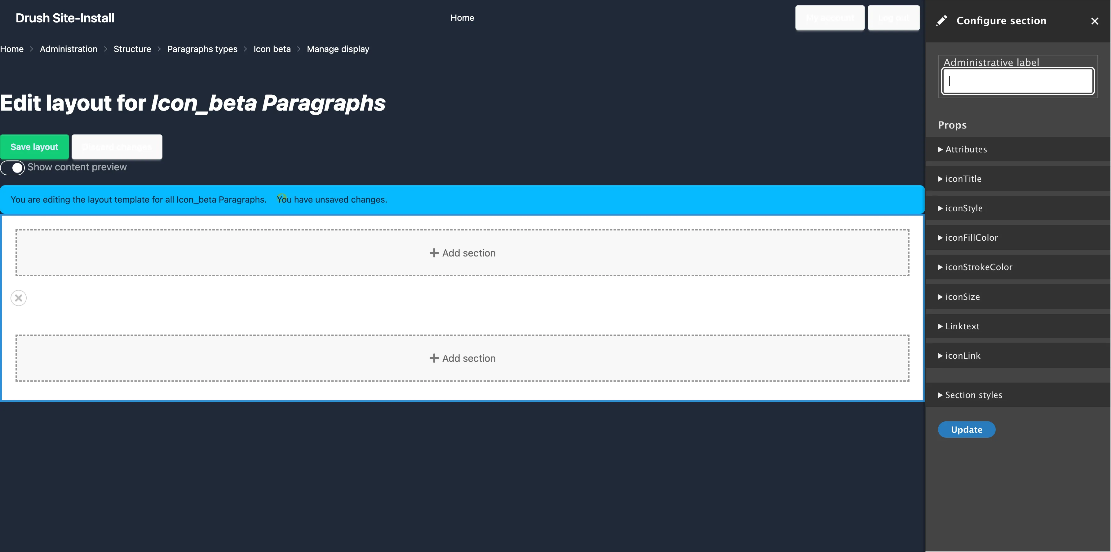
Step 8: Mapping the Data in UI Patterns
Now that we’ve created our view modes and enabled Manage Display, the next important step is mapping the data from our fields into the component. This is where the magic happens — it’s how Drupal knows which field value goes into which placeholder inside our custom_icon.component.twig file.
When you open the mapping tab, you’ll notice that all the fields from your component are listed there. These are coming directly from the structure we defined in the custom_icon.component.twig. Let’s go through it step by step.
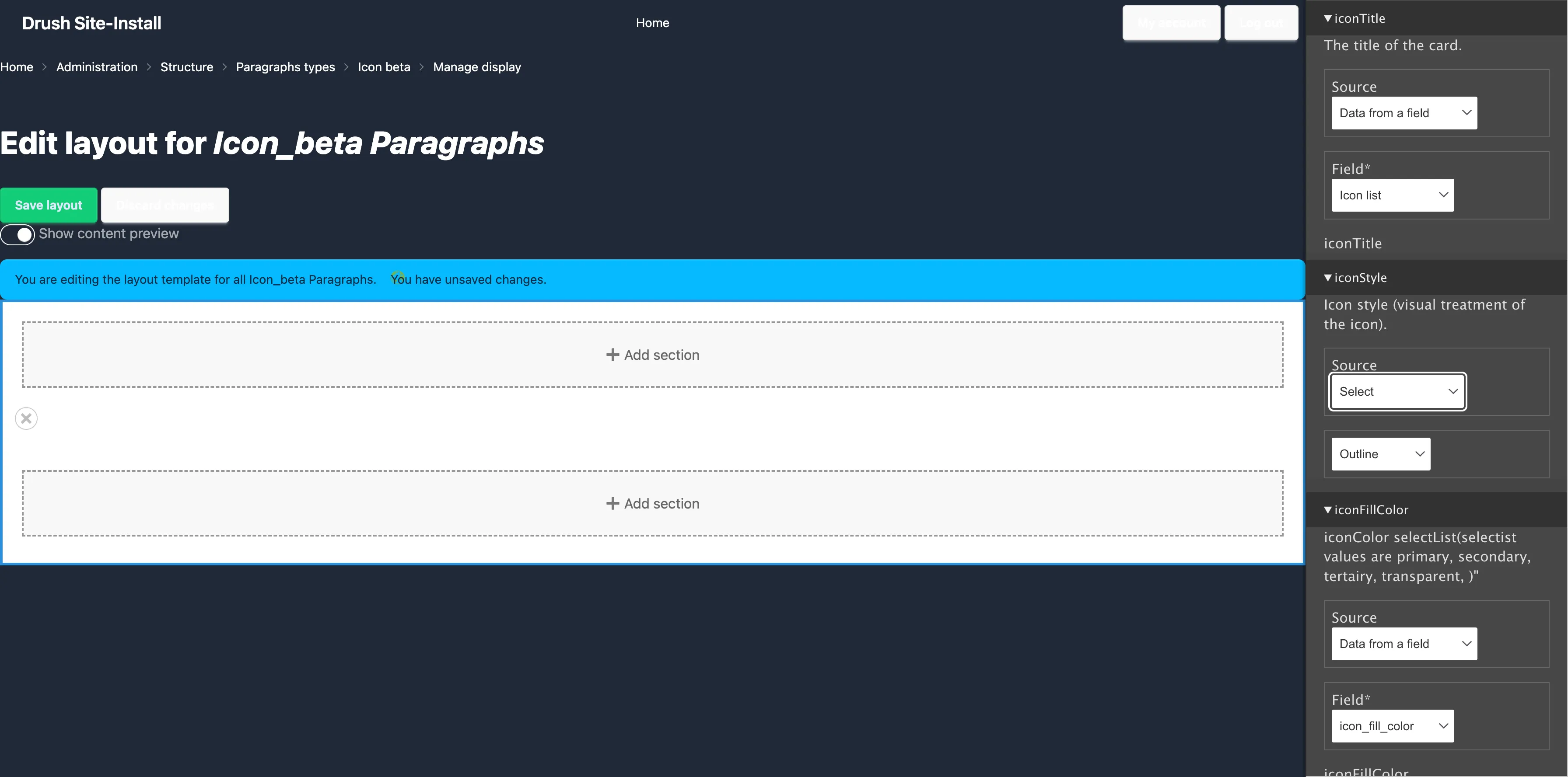
Mapping the Icon Title
For the Icon Title, we get a dropdown with Source options. Here we need to choose:
- Source → Data from the field
- Field → select the field you want to connect. In my case, I selected Icon List.
That’s it! This tells Drupal to fetch the data from the Icon List field and pass it into the component
Mapping the Icon Style
If you remember, earlier we created style classes in the custom_icon.twig file and passed them using enum values. Since these are already defined in the YML file, we don’t need to pick a source from the field this time. Instead, we can directly choose the rendered value.
For example, when mapping the Icon Style:
- Select the option like Fill, Outline, Solid, Roundfill, or Roundoutline (depending on what you want).
These are coming directly from the enum values, so you can just map them without worrying about source/field.
Mapping the Other Fields
For all the remaining fields, the process is similar to how we mapped the Icon Title:
- Source → Data from the field
- Field → Select the field name from the structure.
- Again, under Source, select Field prop: text value.
This ensures the actual text values are passed into the Twig component exactly where they belong.
I’ve shown this in detail for one field (Icon Title) and one enum (Icon Style). You can now repeat the same mapping steps for each of your fields. Once everything is mapped, your component will start pulling real Drupal data and rendering it with the correct styles.
First you need to click on add section then select a component list of all available component will be shown on the right side.
In the next image you will see all the data coming from the component
Visual representation of mapping the fields values to the component
Map the Slot (if any)
If your component has a slot, like iconLink, you will see an area on the layout where it says “Add Block”.
- Click “Add Block” in the slot area.
- Add a block that contains a field or static value (e.g., a link).
- Map this to the iconLink slot. Do mapping like shown in visual representation.
Save Everything
Once props and slots are mapped:
- Click Save Layout
Conclusion
Adding social icons to your Drupal site using SDC components is a flexible and modern approach. It gives full control to developers and editors. You can change icon style, color, and link easily from the UI. This method saves time and keeps your code clean. Once it’s set up, you can use the same component in any content type or paragraph.
That’s it! You’ve now created your own social icon system in Drupal. Try it, and you’ll love how easy and reusable it becomes for your future projects.
Waseem rehman